 Product — Case Study
Systemspec
Role : Design Engineer, solo design + build
Platform : Marketing Site · Design System · UI Kit
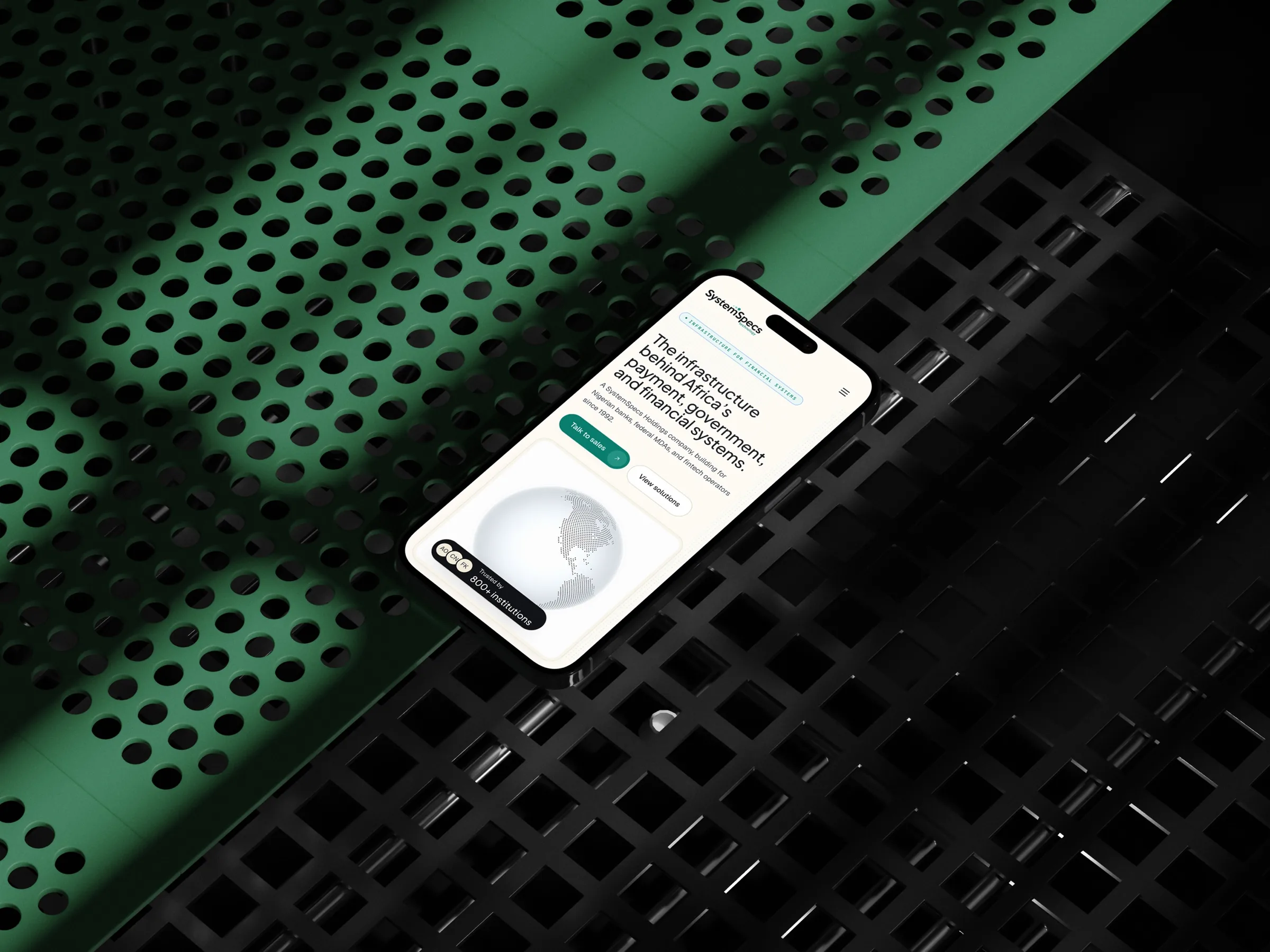
SystemSpecs Technology Solutions runs Remita, the payment rail behind Nigeria's Treasury Single Account, every tier-1 bank and more than forty government ministries. Its website read nothing like that. I rebuilt it from scratch in 3.5 days with Claude as collaborator: a 17-route marketing site, a design system and a UI kit, one repo, one designer.
2026
3.5 days
Claude, Figma, Next.js, Tailwind, TypeScript
Solo, ArtbyAdé
A 32-year-old infrastructure company, presented like a startup template.
The Day-0 audit asked one question: why doesn't the site work for SystemSpecs's actual position? The diagnosis was a credibility gap: the institution behind Nigeria's public-finance rails, undersold by its own front door across information architecture, visual language and messaging.
Position undersold
The visual language read smaller than a company that moves government money at national scale.
No system underneath
Pages assembled ad hoc, nothing compounded from one page to the next, and nothing enforced consistency.
Messaging without a reader
Copy and CTAs spoke to no one in particular, not the ministries, not the banks, not the developers.
Day 0 produced the brief before the build: a PM-grade UX/UI audit and PRD, written with Claude and anchored on the credibility gap. Not a critique of font choices: a diagnosis of position. Every Day-1 decision referenced a line in that document.
The direction it set was named in the brief: Editorial Luxury, treat the marketing pages like a long-form publication, not a SaaS template. Plus Jakarta Sans for display, Geist for body, Source Serif 4 for pull-quotes, JetBrains Mono for captions, on an 88rem, 12-column editorial grid.
"Treat the marketing pages like a long-form publication, not a SaaS template."
System before pages. Day 1 shipped nothing visible, just tokens in three layers: primitives at the bottom, semantic meaning in the middle, component usage on top. Every colour on the site resolves through that chain, which is why light and dark mode are bindings, not repaints. The monorepo splits foundations, brand, site and UI kit, so each deliverable pulls only what it needs.
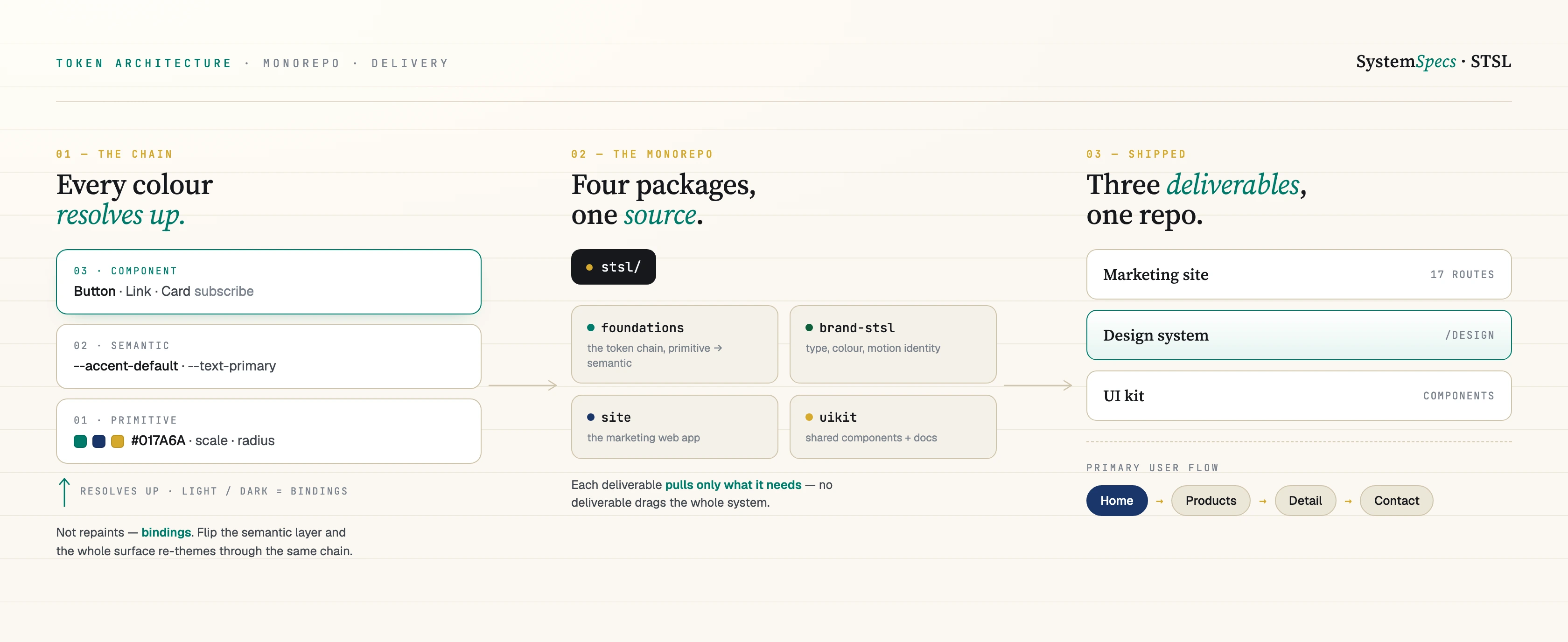
This is the literal token architecture behind the rebuild, not a screenshot of it. Reference-tier colour scales, a role-based type system, an 8-step spacing scale, and the actual source that binds them to the STSL brand, pulled straight from the repo. The live design system linked below is the same thing running; this is the same thing readable.
/* Accent — anchor teal + supporting ink for high-emphasis editorial.
   Teal hex values sampled directly from the SystemSpecs Holdings parent
   mark dot motif (deep dot #017A6A).

   accent-default-hover stays in the teal hue (deeper, not a different
   hue) so interactive feedback feels like a state change, not a color
   swap. Earlier this was bound to the navy ink, which read as a hue
   jump on every primary-button hover. */
--accent-default: #017a6a;
--accent-default-hover: #014e44;
--accent-emphasis: #1a356a;
--accent-subtle: #e6f4f1;
--accent-contrast: #ffffff;

/* Brand teal trio — sampled from the parent dot motif. Available to brand
   marks that need the literal source teals rather than the system accent
   (e.g. <DotMark> in brand tone). UI components should keep using
   --accent-* so theme swaps remain a single rebind. */
--brand-teal:       #017a6a;
--brand-teal-light: #83bfb7;
--brand-teal-pale:  #b6d8d4;
The accent teal is sampled from the SystemSpecs parent mark's own dot, not picked from a palette, and the hover state stays in-hue on purpose so it reads as a state change rather than a colour swap.
View source ↗// Layer 1: reference color scales. Brand-neutral. Components MUST NOT
// reference these directly — they read system tokens, which are bound to
// these scales by a brand package (e.g. @systemspecs/brand-stsl).
export const reference = {
neutral: {
0: '#ffffff',
50: '#f7f8f9',
100: '#eef0f2',
200: '#dde1e6',
300: '#c4cad1',
400: '#a0a8b2',
500: '#7a828d',
600: '#5b626c',
700: '#41464e',
800: '#272a30',
900: '#16181c',
950: '#0b0c0f',
},
teal: {
50: '#eafaf6',
// …
600: '#0d7a60',
// …
},
// …
} as const;The reference tier the brand file above binds to: brand-neutral, components never touch it directly.
View source ↗Three deliverables, one repo. A 17-route marketing site across solutions, products, company and developers. A design system that documents what the build is made of. A static UI kit that lets a developer pull the primitives without bringing the brand. All of it a single static export, free to host, seconds to redeploy.
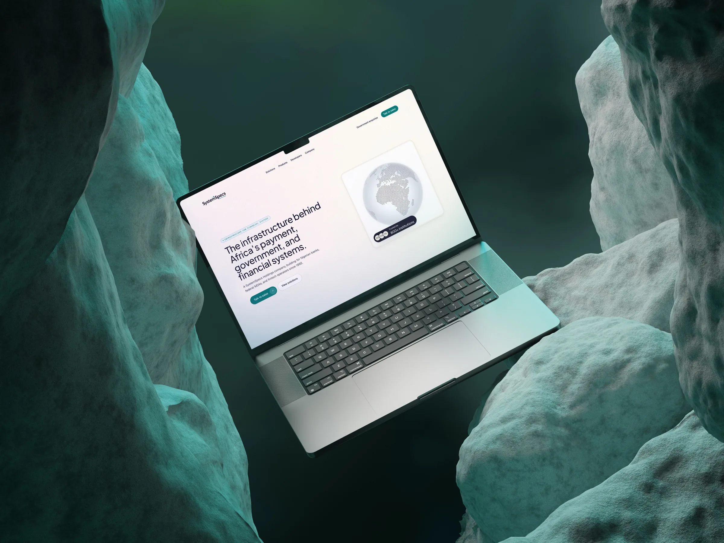
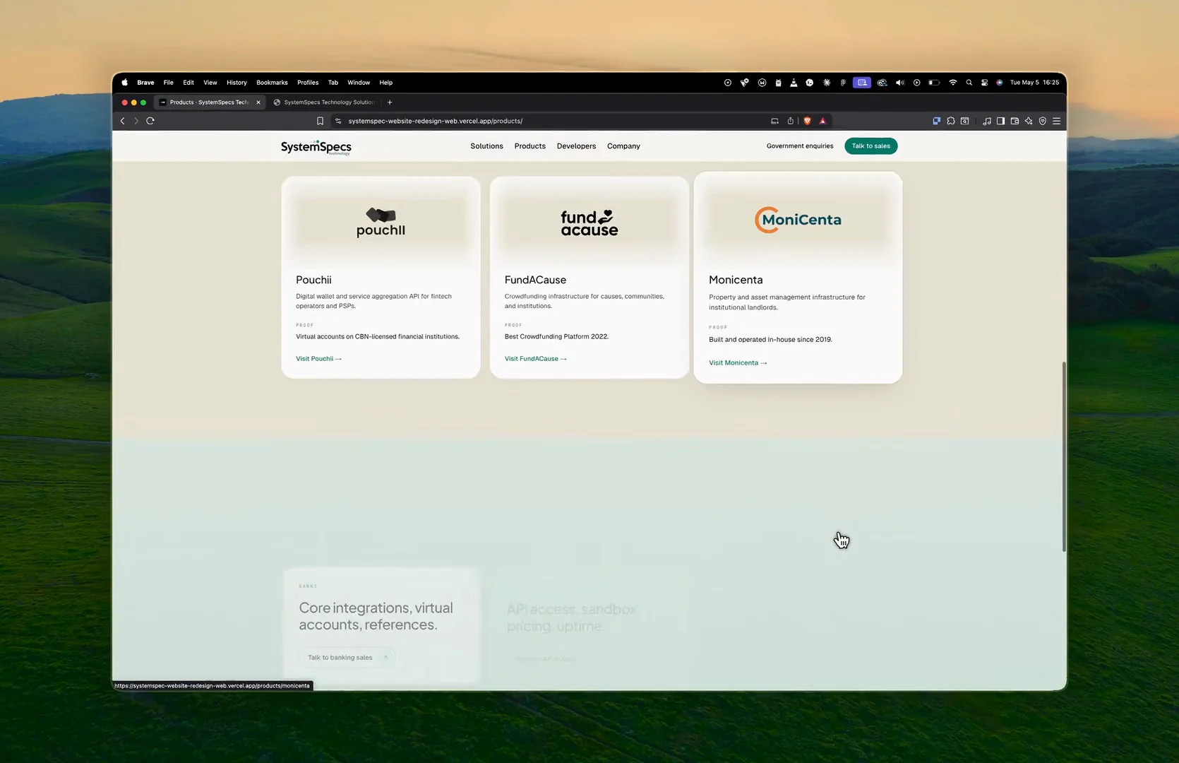
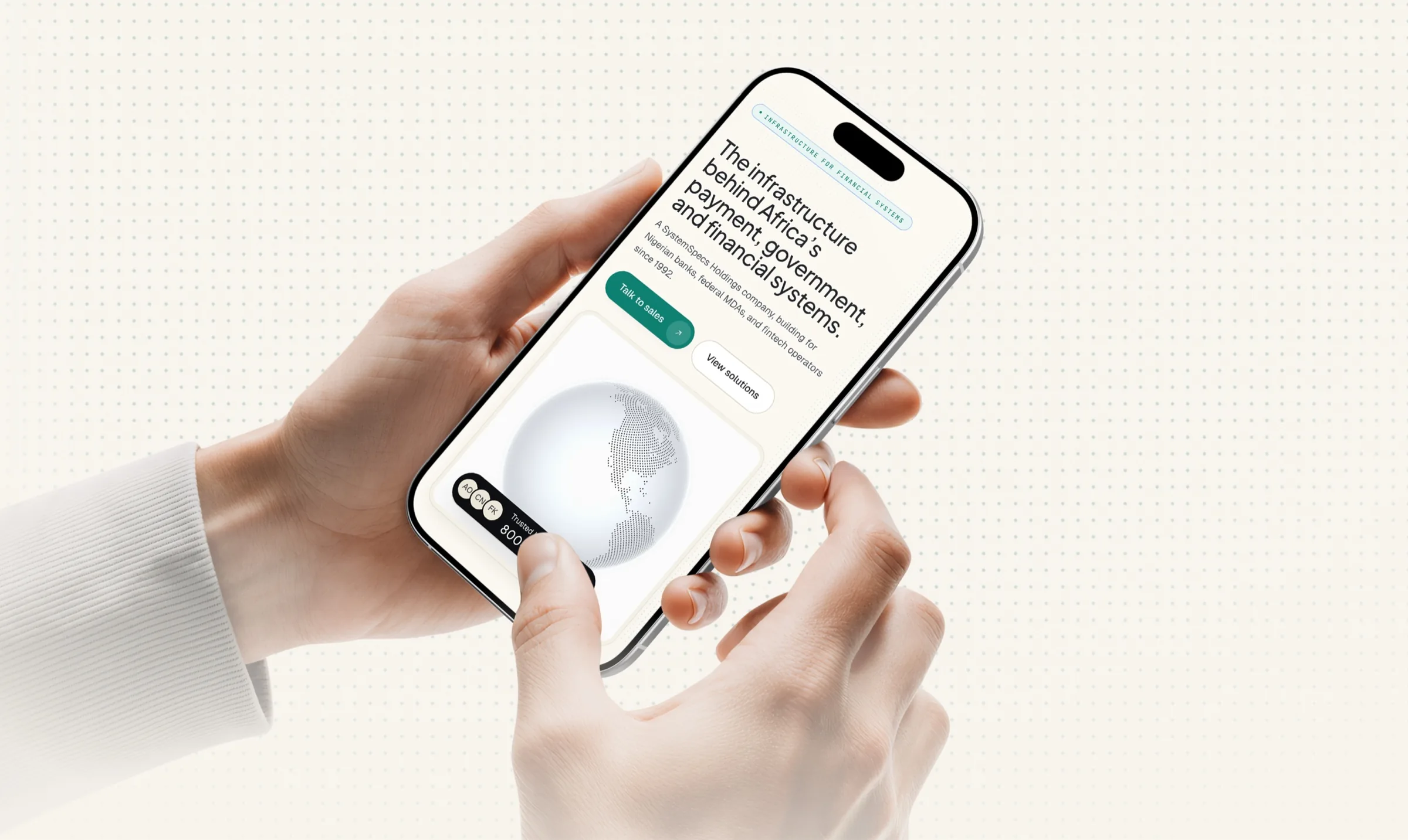
A national institution that finally reads like one.
The rebuild gave SystemSpecs a front door at the scale of its infrastructure, and proved the workflow: brief to deployed v1 in 3.5 days, with the design system as the contract that keeps every future page on-system. The full build story is published as a long-form case study.
17
Routes shipped: solutions, products, company, developers
3.5 days
Brief to deployed v1
3
Deliverables: site, design system, UI kit